Why Pantone Matters in Printing and Packaging
In the world of printing and packaging, color isn’t just an aesthetic choice; it’s a language that speaks directly to consumers’ emotions and brand perception. Research indicates that 85% of shoppers make purchase decisions based on color alone, underscoring how critical a unified color palette can be for brand identity. Among all color systems, Pantone stands out for providing a standardized, universally recognized approach to color matching, ensuring that your specific shade of blue, green, or red remains consistent whether you’re printing in Boston or Beijing.
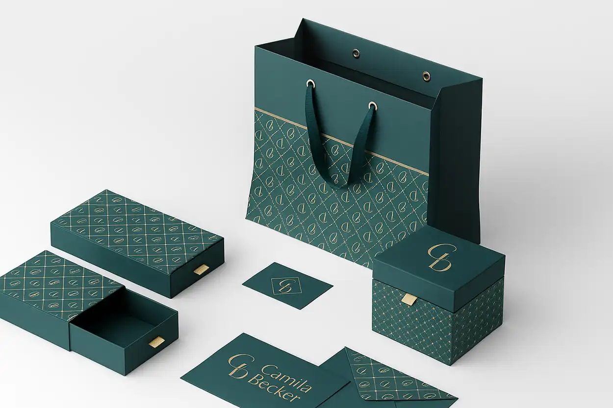
Packaging shapes first impressions—an elaborately designed box or label can signal luxury, sustainability, or innovation. Yet no matter how striking the graphics or typography, mismatched colors between product lines or across different regions can dilute brand recognition and customer trust. This is precisely where Pantone’s advantage becomes indispensable: a spot-color system that allows brands to replicate a color with remarkable accuracy across a variety of substrates, coatings, and printing methods.
Moreover, the rise of global printing supply chains makes consistency more challenging than ever. A brand could design its packaging artwork in New York, print it in multiple plants across Asia, and then distribute to markets in Europe and South America. Pantone provides the Rosetta Stone of color, bridging geographies and printing technologies so that brand owners, designers, and converters can speak the same color language.
In short, Pantone matters because color matters. Through the chapters that follow, you’ll discover what Pantone is, how to use it effectively, and how it continues to shape modern printing and packaging.
Understanding Pantone: The Color Matching System Explained
The Pantone Matching System (PMS) was developed to solve one critical issue: how do we ensure that a color, once chosen, remains consistent when reproduced across different printers, materials, and locations? Before Pantone, designers and printers often relied on subjective descriptions—“a deep sky blue,” “a warm orange”—leading to frequent misinterpretations. Pantone formalized this process by assigning every color a unique code, accompanied by precise ink formulations.
As of now, the Pantone system comprises more than 1,867 solid colors, each meticulously formulated to match a specific hue. It controls variables like ink concentration and printing conditions so that Pantone 186 C, for example, can be replicated almost identically anywhere in the world, provided everyone follows Pantone’s guidelines. This gives brands unparalleled control over their color choices, from the earliest design phases to the final press run.
Key Benefits of the PMS Approach
- Consistency Across Various Media: Whether you’re printing on glossy paper, fabric, or plastic, Pantone’s standardized formulas guide the printer to achieve the same visual color.
- Extensive Color Library: The expansive range covers everything from neon inks to subtle pastels, enabling designers to find the precise match that suits their brand aesthetic.
- Universality: By using Pantone references, creative teams, brand managers, and print houses around the world can coordinate colors without confusion or guesswork.
Pantone’s market reach speaks for itself. It currently holds around 60% of the global color matching market in printing and packaging (Statista, 2023). Such dominance underscores the trust and necessity that industry professionals place in Pantone’s robust system.
Decoding Pantone Numbers and the “C” vs. “U” Suffixes
If you’ve worked with Pantone color swatches, you’ve likely noticed specific identifiers like “Pantone 300 C” or “Pantone 300 U.” These suffixes denote the type of paper or substrate finish:
- C = Coated: Represents how the ink appears on coated (glossy) paper, which tends to reflect more light, rendering the color more vibrant.
- U = Uncoated: Represents how the color looks on uncoated paper, where ink absorption may lead to a softer or duller appearance.
For example, Pantone 185C on a glossy magazine cover can look distinctly brighter than Pantone 185 U on a rough, uncoated stock for stationery. While the numeric designation (e.g., 185) remains the same, the final appearance can differ substantially based on the coating. Therefore, specifying the correct suffix in your design files is essential to achieving the intended hue.

Why It Matters
- Design Accuracy: Artwork that looks perfect on coated swatch guides could shift dramatically if the final substrate is uncoated.
- Production Efficiency: Clarifying whether a project uses “C” or “U” from the outset helps printers prepare the right ink mixes and avoid costly reprints.
- Brand Consistency: Ensuring the correct suffix across all printed materials maintains a consistent look and feel, an essential factor given that brands stand to increase recognition by up to 80% when using consistent color schemes.
Pantone vs. CMYK: Key Differences in Color Reproduction
Anyone who has dipped a toe in the world of printing knows that CMYK (Cyan, Magenta, Yellow, and Key/Black) is the standard color model for full-color process printing. At first glance, Pantone and CMYK might appear to be competitors, but their functions are quite distinct.
CMYK works by overlapping four colored inks to create a wide range of colors. However, it’s an additive process that relies on precise dot patterns and can sometimes introduce color variation. Slight differences in ink quality or press calibration often yield unexpected results.
Pantone (also called “spot color” printing), on the other hand, uses specially mixed inks. Rather than overlapping multiple CMYK screens, a Pantone spot color is printed as one solid field of color. This method provides more accurate and vibrant hues, eliminating the layering variability inherent in CMYK.
| Feature | CMYK | Pantone |
| Color Creation | Mixes four inks (Cyan, Magenta, Yellow, Black) | Uses pre-mixed inks for exact colors |
| Consistency | Can vary slightly between runs | Highly consistent across different runs |
| Color Range | Broad, suitable for full-color images | Includes unique shades, metallics, and fluorescents |
| Ideal Use | Full-color photographs and prints | Branding materials and logos |
| Cost | Generally more cost-effective for full-color printing | Can be more expensive due to specific ink mixes |
When brand owners realize that 75% of Fortune 500 companies (Pantone Color Institute, 2022) incorporate Pantone for their packaging or logos, it becomes clear that Pantone spot colors play a pivotal role in safeguarding brand integrity.
Applications & Benefits of Using Pantone in Packaging
Packaging is the first touchpoint many consumers have with a product. Color choices shape how people perceive the item: do they see it as luxurious, environmentally friendly, or technologically advanced?
Brand Recognition and Loyalty
Research shows that brands using consistent colors can elevate brand recognition by up to 80%. Take Tiffany & Co. as an example (explored further in Case Studies), where a signature hue can instantly evoke exclusivity and heritage.
Enhanced Printing Quality
Spot-color printing reduces the risk of undesired color shifts that can happen with multi-layered CMYK. This yields crisp, uniform results that pop on store shelves.
Streamlined Global Operations
For brands operating on multiple continents, Pantone’s standardized system ensures the same hue can be replicated worldwide. Color variation across different regions—where packaging might be produced in different plants—is minimized.
Stronger Emotional Connection
Consistent color fosters consumer trust. When customers see their favorite product in precisely the shade they expect, it reinforces positive associations and reliability.
Integrating Pantone with Digital Printing Technologies
As digital printing technologies continue to evolve, questions arise about Pantone’s role in a primarily digital environment. Digital presses can approximate Pantone colors through sophisticated RIP (Raster Image Processing) software, but pure “spot color” capabilities can be limited depending on the device.
Key Points to Consider
- Pantone Emulation: Many digital printers emulate Pantone’s spot colors by using extended ink sets or specialized software. While not always perfect, they achieve a close match for short-run jobs.
- Calibration & Profiling: Regularly calibrating digital equipment and using color profiles that incorporate Pantone references is crucial for consistency.
- Hybrid Approaches: For specialized packaging runs, some printers will produce the majority in CMYK or an extended gamut process, then add a Pantone spot color only where critical. This approach balances cost with visual fidelity.
A Design Week Survey (2023) noted that about 45% of packaging designers prefer Pantone for its accuracy over purely digital color systems—reflecting that Pantone still holds strong appeal in a world where digital printing is rapidly expanding.
How to Choose the Right Pantone Colors for Your Brand
Selecting the perfect Pantone colors goes beyond picking a pretty hue; it’s about aligning your brand identity with consumer psychology and practical considerations.
Brand Strategy Alignment
Delve into color psychology: blues for trustworthiness, reds for energy, greens for eco-friendliness, etc. For instance, a brand that wants to emphasize sustainability might opt for warm earth tones or subtle greens to reinforce its message.
Practical Selection Process
Swatch Comparisons: Use physical Pantone swatch books under neutral lighting conditions. Digital monitors can be deceptive due to screen calibration differences.
Test Prints: Always run test prints on your specific substrate to confirm the final look, especially when dealing with specialized materials.
Sustainability Angle
Recent surveys (Eco Packaging Survey, 2023) suggest that about 60% of brands leverage Pantone’s sustainable color solutions to align with eco-conscious consumer expectations. This can include ink formulations with fewer VOCs (Volatile Organic Compounds) or dyes derived from natural sources.
Common Challenges When Using Pantone and How to Overcome Them
Despite its many advantages, implementing Pantone in printing and packaging can pose specific challenges. Addressing these proactively can save valuable time and resources.
Challenge 1: Limited Color Range in Spot Colors
- Explanation: While Pantone features an impressive array of 1,867 colors, certain brand visuals or gradients may exceed what a single spot color can achieve.
- Solution: Combine Pantone spot colors with CMYK where necessary to broaden the available spectrum without compromising core brand elements. For instance, use Pantone for logos and key brand elements, and CMYK for background images or detailed graphics.
Challenge 2: Higher Printing Costs
- Explanation: Each Pantone spot color may require its own printing plate or special ink mix, which can drive up production costs.
- Solution: Plan your color strategy carefully. If budget constraints are tight, limit the number of Pantone spot colors. Determine which elements absolutely require the spot color for brand consistency, and use CMYK for other design components.
Challenge 3: Material Compatibility
- Explanation: Different substrates—coated paper, uncoated cardboard, plastics, or metal—absorb ink differently, potentially shifting the color’s final appearance.
- Solution: Test Pantone colors on the actual material used for production. Adjust formulations or use alternative Pantone references (e.g., selecting a slightly darker shade to compensate for light absorption on an uncoated stock) to ensure accurate reproduction.
Challenge 4: Transitioning to Digital Printing
- Explanation: Digital presses do not always provide true spot-color printing; they often replicate Pantone colors using a combination of inks.
- Solution: Opt for digital printing technologies that explicitly support Pantone spot inks or advanced color management software for simulating Pantone hues. Regular calibration and test prints help narrow any color discrepancies.
By anticipating these challenges and implementing the outlined solutions, brands can maintain color fidelity without sacrificing cost efficiency or design integrity.
Case Studies: Successful Packaging Designs Utilizing Pantone
Case Study 1: Coca-Cola
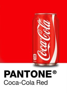
One of the most iconic illustrations of Pantone’s power in brand packaging is Coca-Cola’s signature red. Officially recognized as a Pantone color, Coca-Cola Red appears in nearly every piece of the brand’s marketing collateral—from cans and bottles to global advertising campaigns. This distinctive hue, deeply etched into consumer consciousness, creates an instant link to Coca-Cola’s heritage, quality, and refreshing taste. By standardizing that red through Pantone specifications, Coca-Cola ensures that whether you’re holding a bottle in California or a can in Kuala Lumpur, the brand color and identity remain unmistakably the same. The outcome is a level of brand loyalty and recognition that stands among the strongest in the beverage industry.
Case Study 2: Tiffany & Co.
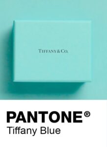
Another iconic use of Pantone in packaging is Tiffany’s famous shade of robin’s-egg blue. Known widely as “Tiffany Blue,” this color is trademarked and has its own Pantone reference to ensure precise reproduction across boxes, bags, and other brand collateral. Tiffany & Co. has built an entire legacy around this single color; seeing a Tiffany Blue box immediately evokes images of elegance, romance, and refined taste. By using a unique Pantone color, the luxury jeweler effectively differentiates its packaging in a crowded market and bolsters its prestige. The unwavering consistency of that blue hue—on everything from engagement ring boxes to annual marketing brochures—cements a unified brand experience that sets Tiffany apart.
Future Trends: The Role of Pantone in Sustainable Packaging
Packaging is on the cusp of transformation, driven by heightened awareness of environmental responsibility. As more brands choose biodegradable, recycled, or compostable materials, the question arises: how will Pantone maintain color accuracy on substrates with varying compositions or textures?
Eco-Friendly Inks
Some Pantone formulations already emphasize sustainability with vegetable-based or low-VOC inks. As regulatory pressures increase, we can expect further innovation.
The Eco Packaging Survey (2023) states that 60% of brands are already integrating Pantone’s “green” solutions into their designs.
Color Matching for Unconventional Materials
Recycled substrates can yield unexpected color shifts due to irregular surface texture or color tints from the recycling process. Pantone’s development of specialized swatches for such substrates is a likely possibility.
Compostable films and biodegradable plastics also require unique considerations.
Technological Innovations
Virtual proofs, 3D color simulations, and AR experiences could allow designers to preview how Pantone colors appear on various sustainable materials before physical printing.
The packaging industry is expected to reach $1.05 trillion by 2027 (Grand View Research, 2023), suggesting that color consistency—and hence Pantone—will remain a key differentiator for brands aiming to stand out in an eco-conscious marketplace.
Pantone Tools and Resources for Designers and Printers
Pantone isn’t just a list of colors; it’s an ecosystem of tools, reference guides, and technology partnerships that streamline the entire color management process.
Swatch Books and Guides
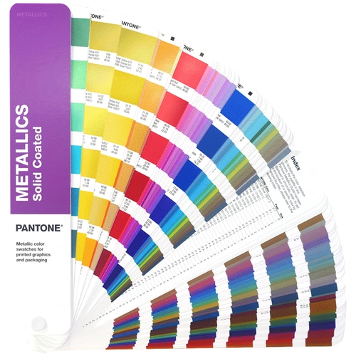
- Pantone Formula Guide (Coated and Uncoated) offers the primary set of spot colors.
- Specialized guides like Metallics, Pastels, and Neons provide additional creative options.
Digital Platforms
- Pantone Connect: A cloud-based service integrated with design software like Adobe Illustrator, allowing users to browse colors, build palettes, and share them with collaborators.
- Mobile Apps: Some Pantone apps let you capture color inspiration in real-time using a phone camera, then find the closest PMS match.
Training and Certification
Pantone and various partner organizations offer color management workshops and certifications. Designers and press operators who complete such programs can confidently handle complex color challenges.
Conclusion: The Impact of Pantone on Modern Printing and Packaging
Pantone is more than a color system; it’s an industry backbone that safeguards brand identity and fuels innovation. In a marketplace saturated with visuals, a single hue—if precisely matched—can spark an emotional reaction and define how consumers remember a brand. Coca-Cola Red, Tiffany Blue—such iconic uses of Pantone exemplify color’s power to transcend language and cultural barriers, uniting consumers under a shared, recognizable aesthetic.
By demystifying Pantone numbers, preparing for potential hurdles (like higher costs or material incompatibilities), and exploiting Pantone’s ever-expanding toolset, brands can achieve impeccable color consistency. Whether a product is showcased on a store shelf, an Instagram feed, or a global TV campaign, Pantone ensures the color story remains unwaveringly accurate. This consistency, in turn, elevates trust, fosters brand loyalty, and contributes to a more sustainable future—especially as the industry leans into green materials and eco-friendly inks.
In short, color commands attention and sets your brand apart in a world where attention spans are short and consumer choice is vast. Pantone’s role in shaping this narrative is fundamental. By mastering Pantone’s use, you’re not only honoring your brand’s visual heritage but also participating in the future of printing and packaging—one shade at a time.