Kraft paper has gained prominence in sustainable and brand-focused packaging, with its market projected to reach about USD 27.75 billion by 2031, growing at 11.10% CAGR (2024–2031). Known for its distinctive natural tone, tear resistance, and eco-friendly connotation, kraft can accommodate a range of packaging needs—from rustic artisanal wraps to sleek e-commerce boxes. However, achieving crisp graphics and refined finishes on kraft’s porous, brown surface requires special considerations in design, ink choice, and finishing steps.
The following sections provide an in-depth roadmap for choosing the right kraft stock, employing effective printing methods, optimizing design, overcoming common pitfalls, and amplifying your brand with thoughtful finishing. Whether you’re crafting boxes for organic foods, shipping mailers for sustainable clothing, or luxurious gift packaging, these insights will help you harness kraft’s earthy appeal while preserving functional performance and brand unity.
Understanding Kraft Paper: Properties and Benefits
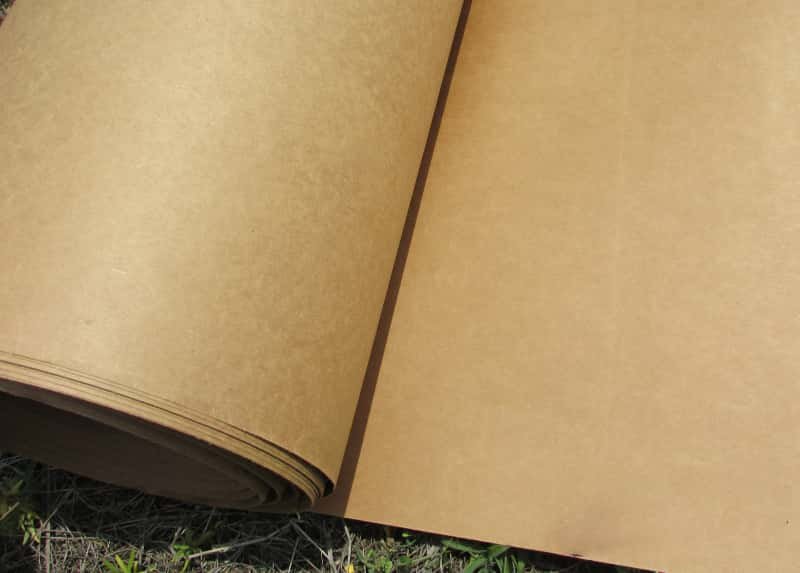
Kraft paper is produced through a special pulping process where cellulose fibers are chemically separated, creating a stronger, longer fiber structure compared to typical papers. This method, known as the kraft process, yields brown paper known for its robust tensile strength and tear resistance. Because of these attributes, it is prized for protective packaging—especially for products requiring sturdiness in transit or daily handling.
Natural Aesthetic and Eco-Friendliness
A major draw is kraft’s earthy-brown coloration, which visually communicates eco-consciousness and authenticity. Many brands choose kraft to underscore sustainability credentials: the paper is often biodegradable and can incorporate post-consumer recycled content, lowering the environmental footprint. As consumer preferences shift toward minimal plastic usage and more renewable resources, kraft’s aura of “naturalness” resonates, potentially boosting brand trust.
Versatile Applications
From bakery boxes and shipping envelopes to upscale candle or skincare wraps, kraft’s adaptability benefits multiple sectors. Food packaging remains its largest consumer, capitalizing on both durability and safe contact properties. Meanwhile, retail and e-commerce brands enjoy how easily kraft surfaces can be branded or stylized, leading to cohesive unboxing experiences. With global kraft paper demand surging, fueled by e-commerce expansions and packaging sustainability movements, it has become a mainstay substrate for modern packaging solutions.
Choosing the Right Kraft Paper
Kraft paper isn’t monolithic; it varies in thickness, surface texture, and coloration. Understanding these variations ensures you pick a stock that aligns with product weight, design goals, and brand budget.
Thickness (Grammage)
Measured in grams per square meter (gsm), kraft can range from lightweight 60–80 gsm (ideal for wrapping sheets or void fill) to heavier 120–400 gsm for forming boxes or rigid package exteriors. Thicker stock offers greater structural support but can be more challenging for certain printing processes—especially if you plan intricate, multi-color designs.
Texture and Finish
Standard kraft typically has a somewhat rough surface and a matte finish, giving it a rustic vibe. However, some mills produce smoother or clay-coated kraft for improved print fidelity. Think about your brand’s aesthetic: is a rugged, fibrous look desirable, or do you want a polished surface more akin to a bleached or coated paper?
Natural Brown vs. Colored Variants
Natural brown is the classic kraft hue, but bleached or dyed versions exist. A bleached white stock might still have the structural benefits of kraft while allowing more vibrant color printing. Dyed kraft can be black, gray, or custom tints, though color consistency can be trickier and might require test prints to ensure accurate brand colors.
Printing Techniques for Kraft Paper
Selecting an appropriate printing method is critical for ensuring crisp imagery, stable inks, and brand consistency on kraft’s brownish surface.
Flexography
Flexo printing uses raised, flexible plates with fast-drying inks. It’s popular for high-volume packaging (e.g., shipping boxes, grocery bags), thanks to speed and cost efficiency. Although simpler designs (solid logos, text) print well, complex multi-color images may appear less vivid unless you use specialized inks or pre-treat the surface.
Offset Printing
Offset, or lithographic printing, delivers high detail and color accuracy, making it ideal for brand visuals with intricate graphics or photography. Yet kraft’s brown base can skew color results—especially for pastel or light brand tones. Printers often lay down a white “underprint” for sections demanding bold color reproduction, though this adds complexity and cost. For large runs of brand-centric packaging with exacting color demands, offset can be a prime choice.
Screen Printing
Screen printing suits shorter runs or artisanal finishes. A fine mesh transfers ink onto kraft, layer by layer, creating bold, opaque results. Designers seeking simple but striking visuals (like big typographic statements, single-color icons, or brand logos) might prefer screen printing. However, layering multiple colors can become labor-intensive, and smaller text might lose sharpness on kraft’s fibrous texture.
Digital Printing
Digital presses shine for low-quantity or customizable prints. Because no plates or screens are needed, setup time is minimal. Nonetheless, achieving vibrant color can be tricky on uncoated kraft. Some advanced digital printers incorporate specialized ink sets or priming solutions to handle the brown background more effectively. If your brand rotates limited-edition prints or seasonal packaging, digital can enable quick changes at modest cost.
Choosing the Right Ink for Kraft Paper
Regardless of your printing method, pigment-based inks usually yield more saturated and consistent tones compared to dye-based. Pigment inks tend to rest atop the fiber, retaining brightness, while dyes may sink in, causing colors to dull. For designs featuring brand-coded pastels or whites, consider white ink layering (if your printer can accommodate it) to maintain clarity. Kraft’s absorbency also suggests using quick-dry or UV-cured inks, preventing smearing and preserving detail.
Design Considerations for Kraft Paper Printing
Kraft’s brown color can be an asset—but if you don’t plan for it, it can distort brand visuals or overshadow certain design elements. Keep these guidelines in mind:
Color Palettes
Dark, saturated colors—blacks, navies, forest greens—pop strongly against brown, providing ample contrast. Soft pastel shades risk fading unless supported by a white base. If your brand relies on subtle pastel or vibrant bright tones, test prints are essential to confirm your chosen hues appear as intended.
Contrast and Visibility
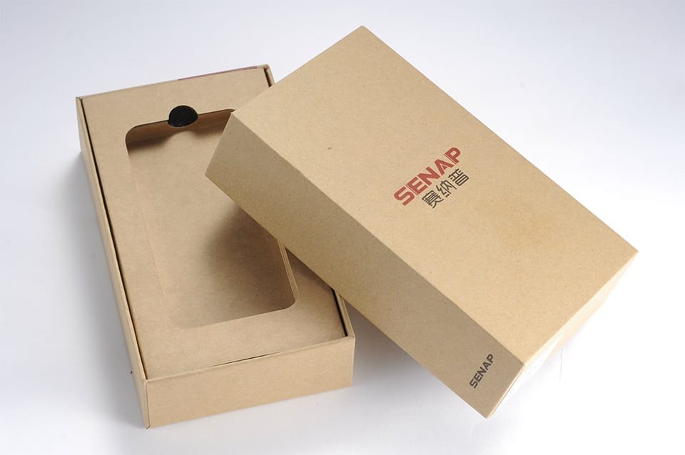
Because of kraft’s low reflectivity and natural speckles, fine lines and small text can become muddy. Opt for bolder lines, slightly larger point sizes for text, or fewer intricate details to maintain crisp legibility. If your design includes photography or intricate illustrations, consider offset printing with a white layer behind key elements.
Brand Elements
Logos that rely heavily on negative space or rely on white for shape definition might disappear on brown. In such cases, either invert the design (printing the brand color) or print an opaque white outline to preserve your brand form. Further, if you aim to highlight “green” brand values, the brown background can serve as an intentional design statement—letting minimal printing amplify the raw, eco-friendly vibe.
Printing White Ink on Kraft Paper
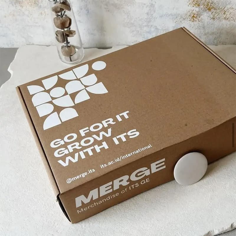
White ink is a game-changer for designs that rely on bright or pastel colors, or that specifically feature white text or logos. Kraft’s brown undertone can wash out these hues unless you neutralize it.
- Undercoating
Some printers layer white ink first, effectively creating a “white canvas” for subsequent color. This approach allows brand-coded or pastel shades to appear as if on normal white paper. - Highlighting Text or Logos
If you only need certain text or icons in white, selective white printing can pop these elements. This is common for brand logos that use white or rely on negative space for shape definition. - Press Capabilities
Not all digital or offset presses handle white ink equally. Discuss your brand’s design with your printing partner to ensure the press used can deposit opaque layers. White ink demands additional runs or specialized spottings, increasing cost and complexity, but the payoff in clarity and brand consistency often justifies it.
Cost and Complexity
White ink significantly improves color pop but can raise production costs. You might consider partial usage—for instance, only undercoating key design zones rather than flooding the entire box. This balanced approach preserves kraft’s earthy personality while ensuring your brand’s visuals remain crisp.
Printing Full Color on Kraft Paper
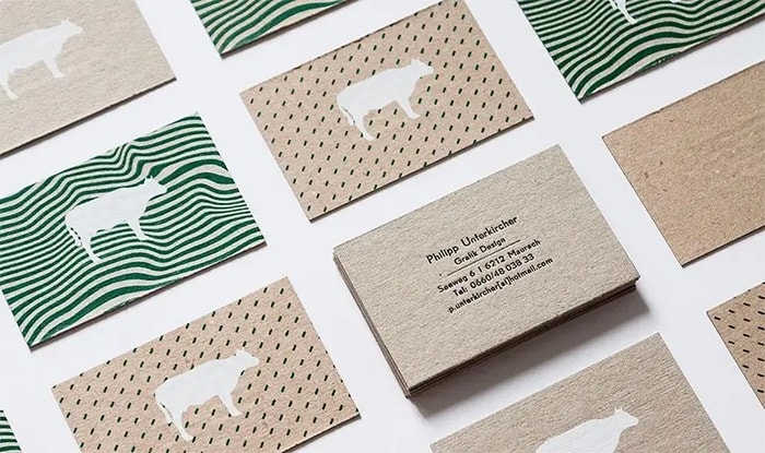
Going beyond minimal logos to full-color branding (e.g., photographic images, intricate illustrations) requires strategic layering or color calibration. Since kraft’s brown base can skew color perception, several approaches can help:
- White-Underlay Then CMYK
Applying a blanket white pass in the region of your design allows your standard CMYK layers to print as if on white stock. This yields the truest brand hue reproduction. - Selective White
If only some design portions need bright color or images, print white behind those sections. The rest of the package can remain raw kraft, aligning with brand minimalism. - Adapted Color Palettes
For simpler layouts, skip white undercoating but adjust the color palette. Darkening or saturating brand colors might produce an acceptable brand match once printed on brown. Test small patches to confirm final tints.
Evaluating Print Quality
Especially for multi-layer, full-color designs, consistency checks (like color swatch references, press test runs) ensure each box or piece matches brand guidelines. A minor color shift might be acceptable on white gloss stock but become glaring on brown kraft.
Common Challenges and Solutions in Kraft Paper Printing
Kraft’s unique traits can challenge both new and seasoned print teams. Below are typical issues and how to address them:
Ink Absorption and Spread
Because kraft is more porous, ink can soak in or spread, blurring edges. Solution: use heavier ink coverage, specialized absorbent-control additives, or an initial primer coat. Slowing press speeds also improves dryness and crispness.
Color Shift
The brown background may create unexpected tints, especially for mid-tone brand colors. Solution: produce small test prints or rely on white underprints for brand-critical or pastel sections. Collaborate with your printer to calibrate color profiles for kraft.
Surface Irregularities
Variations in kraft’s fiber pattern or minor speckles can hamper extremely detailed designs. Solution: incorporate these as part of the aesthetic (rustic, natural) or shift to smoother variants of kraft (like clay-coated) for high-detail imagery.
Finishing Techniques to Enhance Kraft Paper Prints
After printing, finishing steps can transform raw kraft packaging into a polished, brand-signature piece. The trick is choosing methods that complement, rather than conflict, with kraft’s warm tone and texture.
Foil Stamping
Foil stamping, whether gold, silver, or colored foil, creates a dynamic contrast against kraft’s matte brown surface. It’s particularly striking for brand logos or highlight text, giving a touch of luxury or festive flair. However, ensure the stamping glue or heat setting is adjusted for kraft’s fibrous texture.
Embossing/Debossing
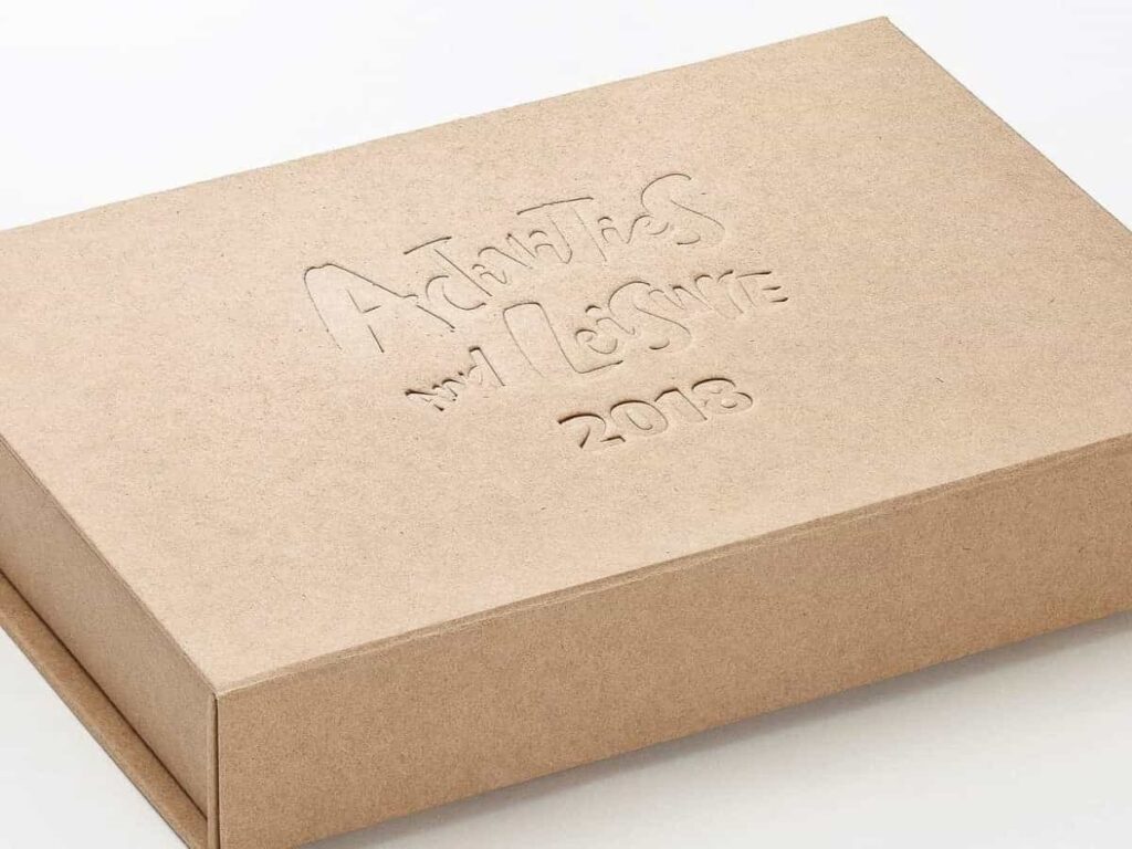
Raising (emboss) or pressing in (deboss) design elements can provide an understated premium feel. On kraft, these dimensional changes often stand out nicely, especially if you keep the background minimal. Some brands pair a subtle emboss with a small portion of printed detail for an artisanal or elegant vibe.
Adding Handles, Window Cuts, and Other Elements
Die-cut handles can transform a simple kraft box into a convenient tote bag-like structure, reinforcing a brand’s functionality. Window cuts allow glimpses of the product—like a candle color or artisanal soap swirl—while retaining the structural integrity of the kraft outer shell. If you choose a transparent plastic window, consider balancing plastic usage with brand sustainability messages.
Applications of Kraft Paper in Various Industries
Kraft’s versatility and earth-friendly image open avenues across multiple market segments. Below are prime examples:
Food and Beverage
Grocery sacks, bakery boxes, coffee bean bags, and farmer’s market stalls frequently opt for kraft to underscore freshness and minimize plastic. This synergy with “natural foods” fosters consumer trust in product authenticity.
Cosmetics and Personal Care
Artisanal soaps, organic skincare lines, or bath bombs can appear more “pure” or “handcrafted” in a kraft box. Adding a simple brand stamp or creative label enhances the brand’s gentle, natural persona.
Retail and E-commerce
Online boutiques often incorporate kraft mailers or small boxes for shipping, capitalizing on cost-effectiveness, protective cushioning, and an inviting natural aesthetic. The unboxing moment can be dressed up with brand-printed tissue or a minimal color pop.
Gifting and Crafts
Kraft’s earthy charm suits artisanal crafts or personalized gift sets. Recipients may appreciate the eco-friendly positioning, especially if the design aesthetic includes calligraphy or minimal line art.
FAQs about Printing and Finishing on Kraft Paper
Can you print on kraft paper with an inkjet printer?
Yes, although standard home inkjets may produce muted outcomes due to dye-based inks. Pigment-based inks or specialized inkjet printers can yield more vibrant color, but test prints are advisable.
What colors work best when printing on kraft paper?
Strong, darker hues—like black, burgundy, or navy—pop well against brown. Lighter colors might need white underprinting for clarity and brightness.
Is white ink necessary for printing on kraft paper?
Not always. For simple black logos or bold, deep colors, you can print directly. However, white ink can unlock pastel or multi-layer color effects, ensuring precise brand color replication.
What finishing options are suitable for kraft paper prints?
Foil stamping, embossing, or adding die-cut windows can all enhance the look. Subtle laminations—matte or soft-touch—might work if you want a refined surface while preserving kraft’s tone.
How does kraft paper’s eco-friendliness benefit businesses?
It aligns with rising consumer demand for greener packaging, potentially attracting a wider audience and enhancing brand trust. Coupled with minimalist designs, it can reduce overall packaging waste and cost.
Conclusion: Enhancing Your Packaging Branding with Kraft Paper
Kraft paper’s earthy texture, solid strength, and sustainable image position it as a prime packaging choice in today’s conscientious market. Its distinct brownish hue can be either a design advantage—accentuating rustic, minimal, or eco-luxe vibes—or a printing challenge that demands careful ink selection, color adaptation, and finishing. By picking the right printing method (offset, flexography, screen, or digital), leveraging pigment-based or white inks, and thoughtfully applying finishing touches (foil, emboss, windows), brands can craft packaging that stands apart on crowded shelves.
As the kraft paper market surges, propelled by consumer demands for authentic and planet-friendly solutions, now is an ideal time to refine your approach. Test prototypes to confirm structural fit and color integrity; adopt brand-cohesive color palettes that complement kraft’s warm undertones; and explore advanced finishes that elevate your final product. With these strategies, you’ll harness kraft paper’s natural allure while delivering eye-catching packaging that resonates with modern buyers—ultimately driving greater recognition and loyalty for your brand.
Contact for a Free Consultation!

