When a potential customer picks up your cosmetic product, you have exactly 90 seconds to make an impression—and up to 90% of that snap judgment is based on color alone. Your packaging color isn’t just aesthetic decoration. It’s your silent brand ambassador, communicating quality, personality, and purpose before customers even read your product name.
Studies reveal that over 90% of consumers consider visual packaging elements when making purchasing decisions, with approximately 80% citing color as a primary factor. For cosmetic brands in today’s saturated market, understanding which colors resonate with customers—and which ones to avoid—can make the difference between success and obscurity.
This guide explores effective color strategies for تغليف مستحضرات التجميل, common pitfalls that derail brand messages, and emerging trends savvy beauty entrepreneurs should watch. Whether you’re launching your first skincare line or refreshing an established brand, these insights will help you craft a color strategy that captivates customers.
The Psychology of Color in Cosmetics
Colors trigger emotional responses that go far deeper than visual appeal. In cosmetics—where products promise transformation and confidence—color psychology becomes your secret weapon. Each hue carries specific meanings that either reinforce or undermine your brand message.
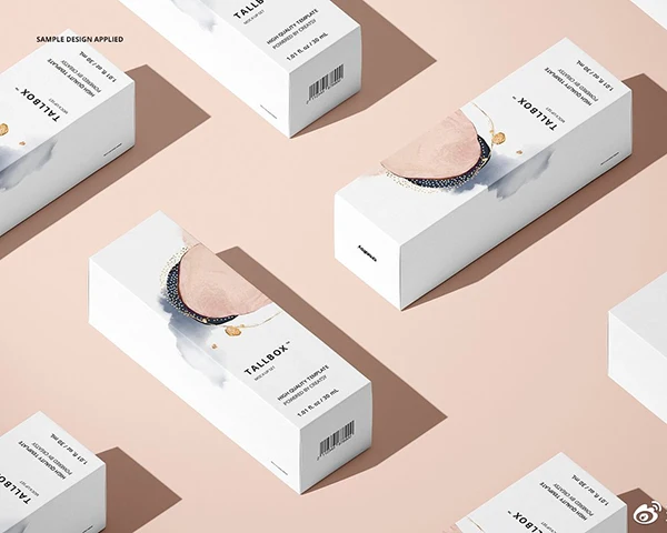
White: Purity and Trust
White dominates skincare packaging because it instantly signals cleanliness, purity, and safety. Brands like Dove and The Ordinary use white to communicate gentle, trustworthy formulations. The minimalist aesthetic also suggests scientific precision—perfect for products promising clinical results.
However, consider cultural context carefully. While white represents purity in Western markets, it symbolizes mourning in many Asian cultures.
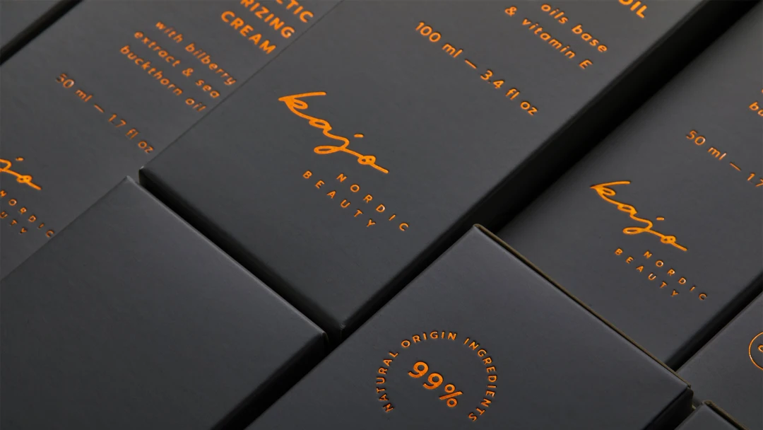
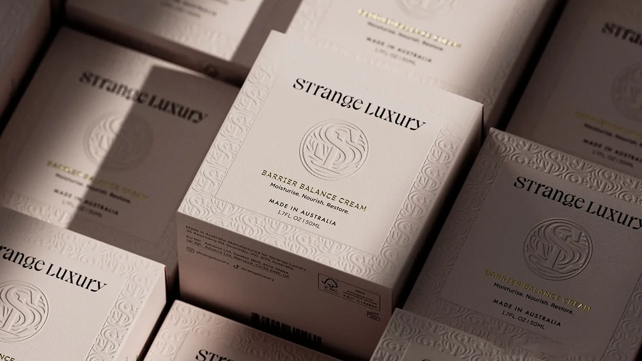
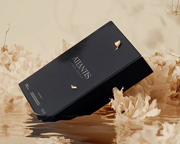
Black and Grey: Luxury and Sophistication
Black packaging screams premium quality. It’s the go-to choice for luxury perfumes, high-end makeup palettes, and men’s grooming lines. War Paint for Men uses stark black to convey masculine authority, while luxury brands pair black with metallic accents to amplify the premium feel. Grey offers similar sophistication with more approachability.
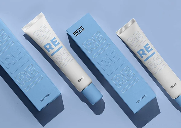
Blue: Trust and Universal Appeal
Blue’s widespread appeal makes it safe for brands targeting diverse demographics. It conveys trustworthiness and reliability—think Nivea’s iconic blue cream tin. However, blue’s popularity can make it appear generic without thoughtful application. Navy suggests professional competence, while bright aqua feels youthful and energetic.
Red: Passion and Bold Energy
Red commands attention and suggests boldness—perfect for statement products like lipsticks. Dark burgundy feels luxurious, while bright red appears more playful but may signal lower pricing. Red works best as an accent color or for products where drama is the intended message.
Green: Nature and Wellness
Green has become synonymous with natural, eco-friendly cosmetics. Consumers automatically associate green packaging with botanical ingredients and environmental consciousness. Dark forest greens suggest premium spa-quality products, while soft sage communicates gentle, sustainable beauty.
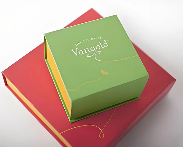
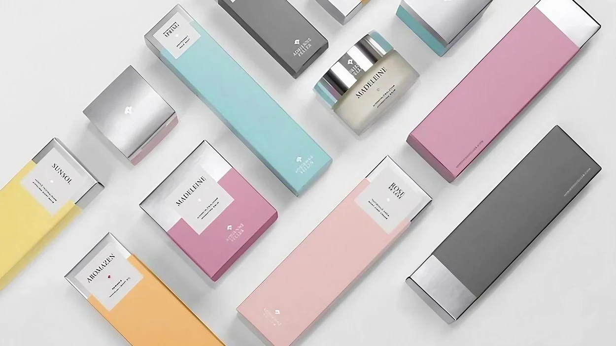
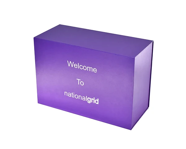
Pink and Purple: Femininity and Indulgence
Pink remains a cosmetics staple, though its application has evolved. Soft “millennial pink” appeals to sophisticated consumers seeking calm beauty rituals, while hot pink targets younger demographics. Purple traditionally suggests creativity and luxury—deep purples with gold accents work beautifully for premium products.
Understanding these associations is crucial because they’re deeply ingrained psychological responses. Your color choice becomes shorthand for your brand values, making alignment between color and message essential.
Aligning Colors with Your Brand Identity
Effective color selection starts with crystal-clear brand identity. Before choosing any palette, ask yourself: What emotions should customers feel? What values do we represent? Who is our ideal customer?
Consider the contrast between Fenty Beauty’s sleek monochromatic packaging and Korean beauty brands’ pastel designs. Both approaches work because they align perfectly with their brand personalities and target audiences. Fenty’s minimalist black and white communicates inclusive luxury, while K-beauty brands use soft colors to appeal to consumers who view beauty as joyful self-care.
Your existing brand colors should inform packaging decisions. If your logo features signature turquoise, incorporate or complement that hue in your packaging. Consistency builds recognition—just ask Tiffany & Co., whose robin’s egg blue is instantly recognizable across all touchpoints.
Cultural and demographic considerations matter enormously. A luxury anti-aging serum targeting affluent women over 40 might benefit from sophisticated gold and cream packaging. A vitamin C serum aimed at Gen Z could embrace bright yellow to signal energy and efficacy.
The smartest brands create mood boards and prototype different combinations before committing. This testing reveals how colors translate from screen to physical packaging and often identifies unexpected winners. Sometimes an unconventional choice becomes a differentiator—like Glossier’s signature pink pouches that helped the brand dominate social media.
What Works: Proven Color Strategies
Use Color to Signal Product Benefits
Smart brands leverage established color associations to set customer expectations. Vitamin C serums often feature yellow or orange packaging to reinforce brightening benefits. Charcoal masks typically use black packaging to highlight the key ingredient. Men’s grooming lines frequently choose black, grey, or navy to appeal to masculine preferences.
Following these conventions helps customers quickly understand your product. However, strategic rule-breaking can create differentiation. The key is intentional deviation for strategic reasons, not arbitrary change.
Maximize Contrast for Impact
High contrast between packaging color and text ensures readability while creating visual punch. Pastel packaging needs darker typography for legibility. This principle becomes critical in the digital age—your packaging must look compelling in Instagram photos and e-commerce thumbnails.
Complementary color combinations create natural contrast while maintaining harmony. Sage green with coral accents, or navy with gold foil details, provides visual interest without chaos.
Pair Colors with Smart Materials
Often-overlooked but highly effective: pairing colors with materials that enhance your desired effect. Frosted glass in pale blue creates an instantly spa-like feeling. Metallic caps allow you to incorporate luxurious secondary colors like gold without overwhelming the design.
Sustainable packaging materials offer unique opportunities. Natural kraft paper provides an earthy base that pairs beautifully with green printing for eco-friendly lines. Many sustainable brands embrace these natural material colors as part of their story.
Test Before You Commit
The most successful color strategies emerge from testing, not assumptions. Create prototypes in different colors and gather feedback through focus groups or social media polls. Colors that look stunning on screen might feel different in person.
Consider A/B testing color variations for product launches. The data will inform future decisions and deepen your understanding of customer preferences.
What to Avoid: Common Color Mistakes
Mismatched Brand Messages
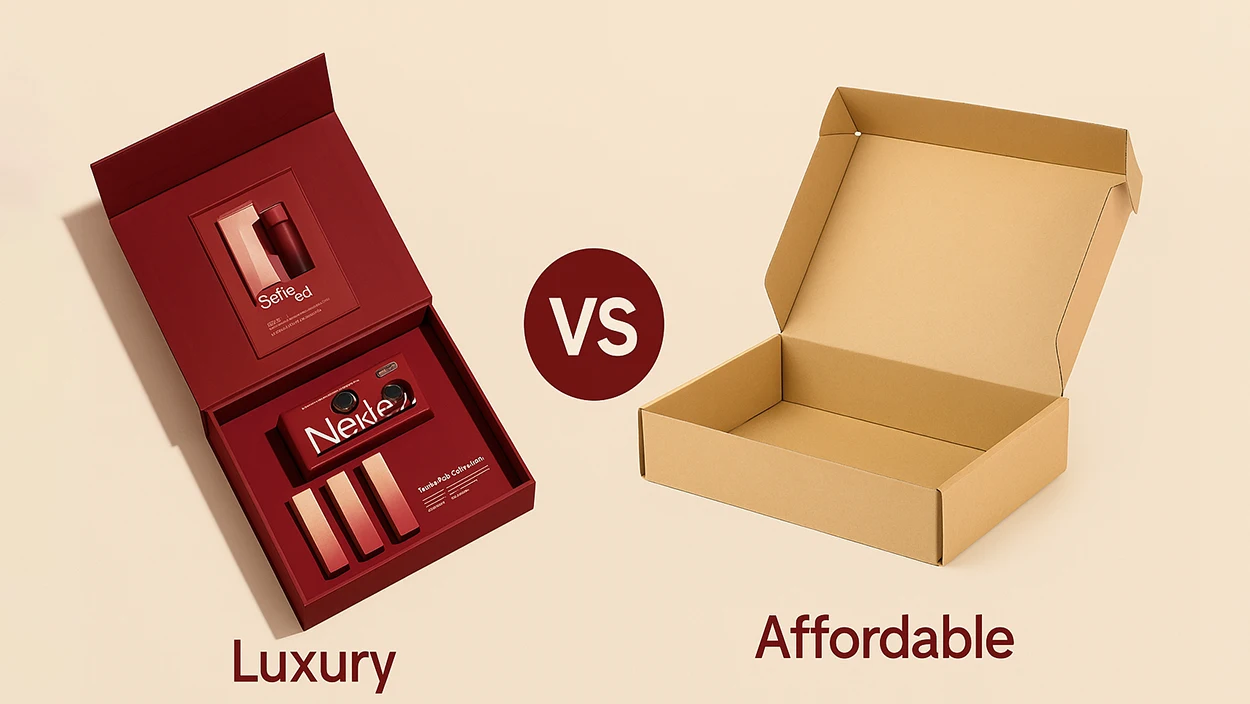
The fastest way to confuse customers is choosing colors that contradict your brand message. A luxury serum in neon packaging sends mixed signals about quality. A gentle baby skincare line in aggressive red and black would alarm parents seeking safe products.
This mismatch often occurs when brands chase trends without considering brand fit. Just because holographic packaging is trending doesn’t mean it works for a heritage brand built on timeless elegance.
Ignoring Cultural Meanings
Global brands must research color meanings across target markets. White packaging might fail in regions where white represents mourning. Red—lucky in Chinese culture—might seem aggressive elsewhere.
Create a cultural color audit for each major market. What works in Los Angeles might not resonate in Tokyo or São Paulo. Smart brands adapt regionally while maintaining core recognition.
Creating Visual Chaos
Too many colors create clutter that confuses rather than attracts. The human eye processes simple, coherent schemes more easily than complex rainbows. Unless your brand specifically calls for playful chaos, stick to one main color with maximum two accent colors.
Poor contrast between packaging and text is equally problematic. Light text on light backgrounds might look sophisticated but fails when customers can’t read product information.
Following Every Trend
Color trends come and go, but your core line needs longevity. Customers build associations with your brand colors—constant change weakens recognition and trust.
Use trends strategically instead. Incorporate trending colors in limited editions or seasonal collections rather than reinventing your entire scheme annually.
Ignoring Production Realities
Colors shift dramatically from digital design to physical production. What looks perfect on screen might appear completely different when printed on your chosen material.
Work closely with packaging suppliers to understand limitations and ensure consistency. Provide precise color specifications rather than approximate descriptions. Consider how colors might fade over time or under different lighting conditions.
Emerging Color Trends (2024–2025)
Earthy, Wellness-Inspired Palettes
The wellness movement has sparked a shift toward calming, natural colors. Sage greens, warm beiges, soft browns, and muted terracotta dominate eco-conscious brands. These colors tap into desires for comfort and self-care while signaling environmental responsibility.
Brands like Herbivore Botanicals have built entire identities around these soothing, earth-inspired palettes.
Bold “Dopamine Beauty” Colors
Simultaneously, a counter-trend embraces vibrant, mood-boosting colors. Brands targeting Gen Z experiment with lime green mascaras, hot pink packaging, and holographic finishes that shift in different light.
This trend recognizes that beauty serves emotional purposes. Bright colors signal fun and self-expression—perfect for consumers who view beauty routines as mood-boosting rituals.
Tech-Inspired Metallics
Beauty’s emphasis on innovation has sparked interest in futuristic palettes. Chrome finishes, iridescent surfaces, and digital gradients suggest cutting-edge formulations. Brands like Fenty Skin use metallics to position skincare as part of a modern, tech-savvy lifestyle.
These colors work particularly well for products with scientific backing or innovative ingredients.
Strategic Color Storytelling
Forward-thinking brands use color changes to mark occasions, support causes, or create collectible moments. Limited editions in unique schemes generate excitement while allowing experimentation without permanent commitment.
Holiday collections in gold and red, spring launches in pastels, or cause-related campaigns demonstrate color’s power as communication beyond aesthetics.
Conclusion – Crafting Your Color Strategy
Choosing cosmetic packaging colors is both an art and a science. It requires understanding color psychology, aligning with your brand identity, and knowing your target market inside and out. The most successful color strategies emerge when creative intuition meets strategic research and careful market analysis.
When done right, colors can dramatically elevate your product’s appeal—attracting the right customers and conveying quality and personality at a glance. However, poor color choices can detract from your message or mislead consumers about what your brand truly represents. The stakes are high because customers form lasting impressions within seconds of seeing your packaging.
Take a balanced approach by using solid research on color psychology and current trends, but always stay true to your brand’s core identity and values. When in doubt, A/B test different options or gather feedback from your target audience. Remember, the ultimate goal is creating an emotional connection with consumers that goes far beyond the product itself.
With the right palette, your packaging won’t just hold your product—it will communicate what your brand stands for before the customer even twists the cap. Take a moment to evaluate your current packaging: does it truly reflect your brand’s personality and appeal to your ideal customers?
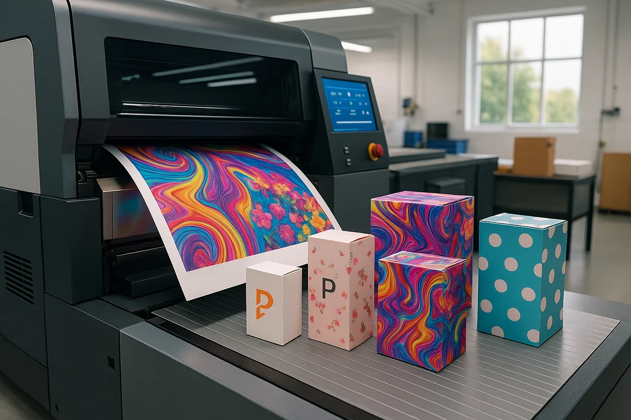
Need help bringing your packaging vision to life? BrillPack’s experts can guide you in selecting colors and materials that make your brand shine in today’s competitive beauty market.