Why Your Packaging Needs That Metallic Magic
Here’s what happens when someone walks into a store: their eyes scan the shelves, skipping past dozens of products in seconds. Then suddenly—stop. Something catches the light. That shimmer, that flash of gold or silver, that irresistible sparkle that makes them reach out and pick up the box.
That’s not luck. That’s the power of metallic packaging.
I’ve been in the packaging industry long enough to know that metallic accents often make the difference between a product that sells and one that sits on the shelf. And I’m not talking about expensive foil stamping. I’m talking about Pantone metallic inks—the cost-effective way to create that premium look without blowing your budget.
The Pantone Metallics system gives you 655 distinct metallic colors to choose from. Whether you’re packaging cosmetics, electronics, jewelry, or premium food products, there’s a metallic color that’ll make your brand shine.
But getting metallic printing right isn’t just about picking a pretty color. It’s about understanding substrates, knowing which printing processes work best, and designing with intention. That’s exactly what we’re covering in this guide—everything we’ve learned about creating stunning metallic packaging that actually sells.
Ready to make your packaging impossible to ignore? Let’s dive in.
What Are Pantone Metallic Colors and Why Should You Care?
Pantone metallic colors are specialty spot color inks formulated with actual metallic pigments—tiny reflective particles that catch and bounce light in ways standard CMYK inks simply cannot. Regular ink sits flat on paper. Metallic ink creates a dynamic surface where light dances across microscopic particles, creating movement and shimmer that changes as the viewer moves. It’s the difference between a photograph of gold and holding actual gold in your hand.
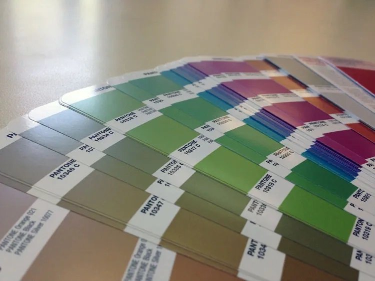
The Two Metallic Families: 655 Colors at Your Fingertips
The Pantone Graphics System divides its metallic colors into two distinct families:
354 Packaging Metallics (10xxx series)
These are your heavy-hitters, specifically engineered for packaging applications. Formulated with advanced base inks like Pantone Silver 10077 C and Pantone Rose Gold 10412 C, these metallics offer:
- Superior durability and resistance to scuffing during shipping
- Brilliant shine that stays bright over time with minimal oxidation
- Coating-friendly formulation—you can apply varnishes without killing the metallic effect
- Better adhesion to coated cardboard, rigid boxes, and specialty substrates
If you’re creating product packaging, this is your go-to series.
301 Commercial Graphics Metallics (8xxx series)
The traditional metallic line, originally designed for brochures and promotional materials. These work beautifully for print collateral but come with limitations for packaging:
- Not coating-tolerant (apply standard varnish and watch your metallic disappear)
- Require expensive multi-layer coating systems
- More prone to oxidation and tarnishing over time
Save yourself the headache—stick with the 10xxx series for packaging.
Why Metallics Matter in Packaging
Let’s be honest about why metallics work:
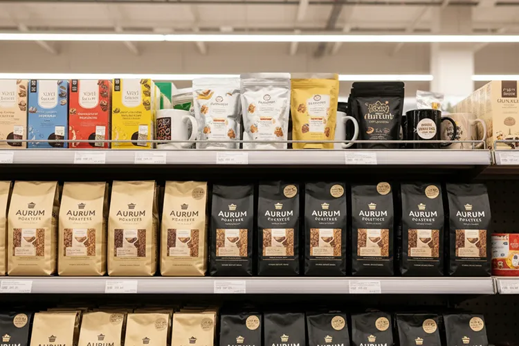
They make your product look expensive. A $25 face cream in a box with gold metallic accents looks like it should cost $60. That perceived value translates directly to purchase decisions.
They create shelf pop. Your metallic packaging literally reflects light into shoppers’ eyes. You can’t ignore it even if you try.
They signal quality instantly. Metallic packaging says “we cared enough about this product to invest in premium presentation.” That message registers in about half a second.
At BrillPack, we’ve produced thousands of packaging projects with metallic accents, and brands that use metallics strategically see measurably better retail performance than those that don’t.
How to Print with Pantone Metallic Inks
Alright, let’s get into the practical stuff—because choosing a beautiful metallic color means nothing if your printing process can’t execute it properly.
Material Considerations: Coated vs Uncoated Stock
This is where packaging projects succeed or fail, and I’m speaking from years of production experience here. The substrate you choose dramatically affects how your metallic inks perform.
Coated Stock (Your Best Friend)
Coated papers and cardboards—whether gloss, silk, or matte coated—deliver the best metallic results. Here’s why:
The coating creates a smooth, sealed surface that prevents ink absorption. Metallic particles sit on top of the substrate rather than sinking into it, which means they reflect more light and deliver that brilliant shimmer you’re after. When we produce cosmetic boxes or electronics packaging, we almost always recommend coated stock for metallic applications.
Benefits:
- Brighter, more vibrant metallic effects
- Better color accuracy compared to your Pantone swatch
- Smoother ink coverage with fewer imperfections
- More efficient ink usage (less absorption means less ink needed)
Uncoated Stock (Proceed with Caution)
Uncoated papers absorb more ink, which dulls the metallic effect significantly. The reflective particles sink into the paper fibers instead of sitting on the surface, reducing their ability to catch and reflect light.
When it works:
- Organic, artisanal, or eco-focused brands seeking a softer, vintage aesthetic
- Craft products where a muted metallic effect aligns with the brand story
- Textured effects where you want metallic to feel more integrated than applied
Coating Applications After Printing
One of the biggest advantages of Pantone Packaging Metallics (10xxx series) is their coating tolerance. This opens up incredible design possibilities:
Spot gloss varnish: Apply over metallic areas to amplify the shine even further while leaving other areas matte. This contrast is chef’s kiss for luxury packaging.
Matte varnish on non-metallic areas: Make your metallic sections pop by surrounding them with soft-touch matte backgrounds. We use this technique constantly for premium cosmetic packaging.
UV coating: Maximum protection against scuffing during shipping, plus enhanced reflectivity. Perfect for jewelry boxes and electronics packaging that need to survive rough handling.
Soft-touch coating: That velvety, luxurious feel combined with metallic accents? It’s packaging perfection. High-end perfume boxes often use this combination.
Pro tip from our production floor: Always request a coated press proof if you’re planning post-press varnishing. A metallic that looks perfect before coating can look completely different after. Don’t skip this step.
[Insert image: Side-by-side comparison of the same metallic gold printed on coated vs uncoated stock]
Printing Processes: What Works Best
Not all printing methods handle metallic inks equally well. Here’s what you need to know:
Offset Lithography (The Industry Standard)
This is our primary method for metallic ink printing, and it’s the industry standard for good reason:
- Excellent color consistency across large runs
- Handles the 10xxx Packaging Metallics beautifully
- Can run metallics inline with your other spot colors and CMYK
- Cost-effective for medium to large production runs (5,000+ units)
- Delivers smooth, even coverage
Flexography
Flexo printing can handle metallics, but with some caveats:
- Works better for simpler metallic applications (solid areas, basic graphics)
- Not ideal for fine details or complex gradients
- Common for labels and corrugated packaging
- More challenging to achieve color consistency
Digital Printing (Limited Applications)
Here’s the truth about digital printing and metallics: most digital presses can’t run true metallic inks. Some newer digital presses offer “metallic toners” or specialty metallic options, but they typically don’t match the quality of offset-printed Pantone metallics.
For short runs or quick prototypes, digital with metallic foil accents might be your best bet rather than true metallic ink.
Screen Printing (Specialty Applications)
Screen printing can deliver extremely heavy metallic ink deposits, creating an almost three-dimensional metallic effect. We occasionally use this for ultra-premium rigid boxes or special edition packaging where budget isn’t a constraint.
- Excellent for bold metallic effects
- Can print on unusual substrates
- Higher cost per unit
- Better suited for small-batch, high-end projects
Combining Metallics with Your Brand Palette
Choosing the right metallic color isn’t just about what looks pretty—it’s about strategic brand alignment. Let me walk you through the most popular Pantone metallic colors and how to integrate them with your brand identity.
Popular Pantone Metallic Colors and Their Brand Personalities
The Gold Family: Timeless Luxury
Gold metallic inks range from pale champagne to rich, deep gold tones. The most commonly specified include:
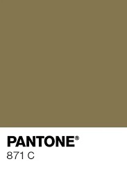
- Pantone 871 C: Rich, warm gold—traditional luxury
- Pantone 872 C: Pale gold with yellow undertones—softer, more approachable luxury
- Pantone 873 C: Light champagne gold—elegant and subtle
Brand associations: Prestige, tradition, premium quality, celebration, achievement, timelessness
Best applications: Jewelry packaging, premium cosmetics, luxury chocolates and confections, high-end spirits, award certificates, premium tea and coffee
Real-world example: We recently produced packaging for a premium jewelry brand using Pantone 871 C for their logo and border accents on cream-colored rigid boxes. The gold caught the light beautifully in retail displays, and sales increased by 23% in the first quarter after the packaging redesign. The client told us customers regularly comment on how “expensive” the packaging feels.
The Silver Family: Modern Sophistication
Silver metallics have evolved significantly with the introduction of Pantone 10077 C, which offers superior brightness and durability compared to traditional 877 C.
- Pantone 10077 C: The new standard—brighter, more durable, coating-friendly
- Pantone 877 C: Traditional silver—still beautiful but with limitations
- Pantone 875 C: Warm silver with subtle copper undertones
Brand associations: Innovation, technology, modernity, cleanliness, sophistication, future-forward thinking
Best applications: Electronics packaging, contemporary beauty brands, tech accessories, premium water or beverage packaging, automotive products, modern jewelry
Why silver works: In a market saturated with gold, silver differentiates. It feels current, fresh, and appeals to younger demographics who associate gold with “old luxury” and silver with “new luxury.”
Rose Gold: The Millennial Magnet
Pantone 10412 C changed the game when it was introduced. This isn’t your grandmother’s metallic—it’s trendy, feminine without being overly girly, and absolutely dominates in certain markets.
Brand associations: Contemporary femininity, trend-awareness, warmth, approachability, Instagram-worthy aesthetics, millennial and Gen-Z appeal
Best applications: Beauty and cosmetics (this is where rose gold truly dominates), fashion accessories, lifestyle products, feminine tech accessories, wellness products, boutique food items
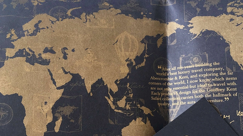
Copper and Bronze: Artisanal Warmth
Often overlooked but incredibly effective for the right brands:
- Pantone 876 C: True copper—warm, rich, organic
- Bronze variations: Deeper, more grounded than gold
Brand associations: Craft, artisanal quality, heritage, authenticity, warmth, organic, handmade, vintage-inspired
Best applications: Craft spirits and beer, organic food products, artisanal chocolates, heritage brands, eco-friendly products, specialty coffee
Color Harmony Strategies: Making Metallics Work with Your Brand Colors
Here’s where design meets strategy. Metallic inks don’t exist in isolation—they need to work harmoniously with your existing brand palette.
Complementary Color Schemes
Pairing metallics with colors opposite them on the color wheel creates maximum contrast and visual impact:
- Gold metallics + deep navy, emerald green, or rich purple: Classic luxury combinations
- Silver metallics + deep burgundy, cobalt blue, or forest green: Modern sophistication
- Rose gold + teal, deep green, or charcoal: Contemporary elegance
- Copper + deep blue or rich purple: Artisanal premium
Analogous Color Schemes
Using colors adjacent to your metallic creates a more harmonious, sophisticated look:
- Gold metallics with warm tones: Cream, peach, warm brown, terracotta
- Silver metallics with cool tones: Ice blue, lavender, cool gray, mint
- Rose gold with warm-cool bridges: Blush pink, mauve, dusty rose, soft coral
Analogous schemes work when you want elegance over impact—perfect for premium products where customers are already shopping deliberately.
Creating Contrast with Matte Backgrounds
Pair metallic accents with matte or soft-touch coatings on non-metallic areas. The matte areas recede while the metallic areas advance, creating dimensional interest even on flat packaging.
Use metallic for:
- Brand logo (draws immediate attention)
- Product name or hero claim (highlights key benefits)
- Decorative borders or patterns (frames the design)
- Quality seals or certification marks (enhances credibility)
Keep body copy and supporting information in matte finishes for readability.
Using Metallics as Accents vs. Primary Colors
Metallics work best as accents, not primary colors. This approach is more cost-effective, creates focal points that guide the eye, maintains readability, and allows the metallic to shine without overwhelming.
Think of metallics like jewelry that completes an outfit—not the entire outfit itself.
Brand Identity Alignment
Your metallic choice should reinforce your brand personality:
- Traditional luxury → Gold
- Modern innovation → Silver
- Feminine contemporary → Rose gold
- Artisanal authenticity → Copper/bronze
[Insert image: Brand mood board showing metallic color selection aligned with brand personality, target customer, and competitive positioning]
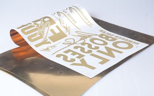
Metallic Ink vs. Foil Stamping: The Great Packaging Debate
[Insert image: Side-by-side comparison showing the same design executed in metallic ink vs. foil stamping, highlighting visual differences]
“Should we use metallic ink or foil stamping?” This is the question we get asked often when discussing with a client about a packaging project.
The answer isn’t one-size-fits-all, so let me break down exactly how these processes differ and when each one wins.
Key Differences Between the Two Processes
How They Work:
Metallic ink printing applies specialty inks containing metallic particles directly onto the substrate using conventional printing processes (typically offset lithography). The ink gets transferred from plates to blankets to paper, just like any other ink—except these inks shimmer.
Foil stamping uses heat, pressure, and metal dies to transfer a thin layer of metallic foil from a carrier roll onto the substrate. It’s a separate post-press operation that requires specialized equipment and custom dies.
Comprehensive comparison of Metallic Ink vs. Foil Stamping
| Feature | 🌟 Metallic Ink | ✨ Foil Stamping |
| Visual Effect | Soft-to-medium shimmer | High-gloss, mirror finish |
| Design Strength | Gradients, fine lines, large coverage | Solid shapes, sharp edges, specialty foils |
| Cost & Process | Lower cost / In-line printing (Faster) | Higher cost / Separate die process (Slower) |
| Best For | Complex designs | Ultra-premium |
| Color Options | 655 Pantone metallics | Limited standard foil colors |
| Durability | Good | Excellent |
Origins of Pantone Metallics
Pantone recognized early on that metallic pigments—whether gold, silver, or specialty hues—could differ drastically in sheen, depth, and reflectivity. To address these inconsistencies, the company introduced dedicated reference books complete with formulas, printed samples, and usage guidance. This effort aimed to help designers and print professionals maintain uniform metallic color usage, a critical factor for brands dedicated to high-quality, cohesive packaging.
Color Range and Innovation
Today, Pantone’s lineup boasts 655 metallic shades, illustrating the growing demand for nuanced, eye-catching finishes. Beyond common gold or silver, designers can explore:
- Rose Gold
- Bronze
- Iridescent Hues
- Matte Metallic Tints
This diversity empowers brands to seamlessly align packaging color schemes with their unique brand identity, all while adding a sense of novelty that captures consumer attention.
Key Aspects of the Pantone Metallic Color System
- Pigment Formulas
Each color swatch corresponds to a specific recipe, ensuring printers can accurately replicate the hue during production. - Material-Specific Guidance
Pantone provides best practices for applying metallic inks on coated vs. uncoated stocks, helping avoid unexpected dullness or color shifts. - Color Stability
Metallic formulations aim for vibrant, consistent results across multiple print runs, preserving brand cohesion over time.
Popular Metallic Pantone Colors
While the comprehensive metallic range spans hundreds of options, some hues stand out for their symbolic value, widespread use, and consumer appeal:
1. Pantone 871 C (Gold)
- Symbolism: Luxury, prestige, and elegance
- Applications: Frequently used in cosmetics, jewelry, and high-end foods to evoke premium quality
- Impact: Envelopes packaging in a rich, warm tone, boosting perceived value
2. Pantone 877 C (Silver)
- Symbolism: Modernity, sophistication, and innovation
- Applications: Common in electronics, automotive parts, and contemporary cosmetic lines
- Impact: Provides a reflective, streamlined finish for a sleek, futuristic look
3. Pantone 871 C (Bronze)
- Symbolism: Warmth, tradition, and authenticity
- Applications: Ideal for artisanal food products, premium liquors, and vintage-inspired designs
- Impact: Infuses a rustic, timeless charm that highlights craftsmanship
4. Pantone 8203 C (Rose Gold)
- Symbolism: Femininity, romance, and elegance
- Applications: Popular in beauty and fashion packaging, lending a unique and trendy visual appeal
- Impact: Offers a soft, pinkish hue that resonates with a wide audience
5. Pantone Process Black C (Black Metallic)
- Symbolism: Authority, sophistication, and strength
- Applications: Used in luxury goods, corporate branding, and high-end packaging to convey seriousness
- Impact: Produces a bold contrast, elevating other design elements through a polished metallic surface
6. Pantone 8161 C (Copper)
- Symbolism: Warmth, durability, and elegance
- Applications: Suitable for high-end beverages, personal care items, or niche gift sets
- Impact: Delivers a distinct metallic sheen that stands out in crowded retail environments
How to Choose the Right Metallic Color for Your Brand

With so many metallic finishes available, picking the perfect color can feel overwhelming. The key is aligning your choice with brand identity and consumer expectations.
Brand Identity Alignment
Do you envision your brand as high-tech or classic and refined? A futuristic brand might lean on silver or steel-like metallics, while a heritage brand might gravitate toward gold or bronze.
Color Psychology and Messaging
- Gold: Luxury, tradition, warmth
- Silver: Modernity, sophistication, sometimes minimalism
- Copper: Unique, artisanal, earthy warmth
- Pearlescent Pastels: Elegance, softness, feminine appeal
Practical Considerations
Beyond color psychology, you should also factor in printing limitations. Metallic inks, Pantone metallics, or foil stamping each behave differently depending on the substrate, coverage area, and design complexity. Testing or prototyping is prudent before a large-scale production run.
Comparing Metallic Inks vs. Foil Stamping
Though both produce reflective elements, metallic ink printing and foil stamping differ in cost, application, and aesthetic results.
Process and Equipment Differences
- Metallic Inks: Printed as part of the normal press run using specialized inks containing metal flakes or pearlescent pigments.
- Foil Stamping: Uses a heated die and a foil film pressed onto the substrate, transferring the metallic layer through temperature and pressure.
Cost and Aesthetic Contrasts
Foil stamping tends to incur higher setup costs (dies, separate runs) and yields sharper reflections. Metallic inks, on the other hand, can be integrated into a single pass and create flexible design possibilities but might not match the brilliance of foil’s mirror-like finish.
Best Use Cases
- Foil Stamping: Ideal for text or logos requiring high impact, especially where a truly mirror-like reflection is desired. Common in luxury or gift packaging.
- Metallic Inks: Better for more extensive coverage, subtle gradient effects, or budget-friendly metallic touches. Particularly suitable for mid-range products or seasonal packaging.
| Printing Technique | Advantages | Limitations |
|---|---|---|
| Metallic Ink Printing | Eye-catching effects, wide range of color | Can be more expensive, requires specialized knowledge. |
| Foil Stamping | High shine and texture, excellent for logos and text | Limited color options, not suitable for intricate designs. |
Applications of Pantone Metallic Colors and Metallic Ink Printing Across Industries

Metallic finishes resonate with consumers across a spectrum of markets. Here’s how diverse sectors leverage them:
Cosmetics and Personal Care
Lipstick packaging, highlighter palettes, or skincare jars often incorporate rose gold or champagne silver details to exude opulence. Metallic highlights can also reflect product benefits—like “radiance” or “sparkle.”
Food and Beverage
- Premium Labels: Wine, craft beer, or gourmet tea often rely on metallic elements to stand out.
- Holiday Products: Metallic reds, greens, or gold create festive vibes, common in confectionery or special-edition items.
Tech and Electronics
Brands like smartphone manufacturers or audio equipment producers might incorporate silver or gunmetal accents, symbolizing innovation and cutting-edge design. Even subtle lines in metallic ink can elevate a product box from ordinary to futuristic.
Luxury and Gift Items
From chocolates in gold-stamped boxes to jewelry in pearl-foiled packaging, metallic finishes underscore the notion of exclusivity. Gift sets, collectibles, or limited editions frequently employ multiple metallic colors for a “wow factor.”
Design Considerations for Effective Use of Metallic Colors and Inks
A successful metallic packaging design demands more than just picking a shiny hue—it involves technical and aesthetic harmonization.
Substrate Choice
Coated papers or films often yield the best metallic reflectivity, as the coating prevents ink from soaking in and dulling the finish. In contrast, uncoated or textured papers can create interesting but more subdued results.
File Preparation and Pantone Spot Colors
When working with Pantone Metallic Colors or specialized metallic inks, designate them as spot colors in your design software. This ensures the print provider knows exactly where and how to apply the metallic. Overlapping elements might require advanced layering or partial knockout.
Limitations and Workarounds
Fine Detail: Tiny fonts or lines can sometimes lose clarity if the metallic particles are too large. Testing or proofing is essential to confirm legibility.
Cost Considerations and Budgeting
Gradients: Metallic inks generally don’t reproduce smooth gradients as seamlessly as CMYK. Designers might overlay partial tints or combine metallic ink with transparent layers.
Cost Factors and ROI of Implementing Metallic Colors and Inks in Packaging
Integrating metallic finishes can drive up packaging costs, but the return on investment can be significant if the enhancement leads to better brand recognition and increased sales.
Influence on Overall Packaging Budget
- Metallic Inks: Usually adds a marginal cost to standard printing. The expense might be slightly higher than standard spot colors but lower than separate processes like foil stamping.
- Foil Stamping: Requires dies and additional pass on press, increasing both materials and labor.
Projected Sales Uplift
Given that a visually appealing package can sway up to 70% of consumers (KMS Litho), adopting metallic highlights can theoretically boost brand visibility and purchase likelihood. While the exact ROI depends on product category and target demographics, the marketing value often justifies the added expense.
Scaling and Economies of Scale
Higher production volumes can amortize setup costs (e.g., die-making or specialized ink shipments). Brands looking to do small-run or seasonal packaging might consider digital or partial metallic coverage to keep costs manageable.
Sustainability and Eco-Friendly Metallic Printing Options
Environmental considerations are increasingly critical, and metallic printing is no exception.
Advancements in Metallic Ink Formulations
Many ink suppliers are developing low-VOC or water-based metallic inks, reducing the chemical footprint. These formulations aim to deliver the same sparkle while being less harmful to the environment.
Foil Recyclability
Traditional foil stamping can hinder the recycling process if large foil areas cover the substrate. However, thin or partial coverage foils are often deemed acceptable in many paper recycling streams. Some foil manufacturers offer more eco-friendly, recyclable or compostable foils, though these remain niche.
Responsible Sourcing
Sustainable packaging also extends to using FSC– or PEFC-certified paper stocks and ensuring metal pigments or minerals are ethically sourced. Brands increasingly highlight these choices to appeal to eco-minded consumers.
Frequently Asked Questions About Pantone Metallic Colors and Metallic Ink Printing
What are Pantone metallic colors?
Pantone metallic colors are specially formulated hues that incorporate metallic pigments, giving them a shimmering, reflective quality. Unlike standard Pantone colors, which are primarily flat and matte, metallic colors add depth and a premium feel to any design.
Can metallic inks be used on all packaging materials?
While many materials (paperboard, plastics, some flexible films) can support metallic inks, results vary. Smooth, coated surfaces typically produce sharper metallic reflections than porous or heavily textured stocks.
How do you print with metallic inks?
You’ll need spot metallic inks containing metal or pearlescent particles. The printing press might require separate ink units and careful calibration for the best reflective effect.
What is the difference between metallic inks and foil stamping?
Metallic inks are integrated into the printing run, generally yielding a subtler sheen. Foil stamping uses a separate process with heat, pressure, and foil films to create a high-gloss, mirror-like finish.
Why should I use Pantone colors in my packaging?
Pantone’s system ensures color fidelity across different printers and substrates, making it easier to maintain brand consistency—particularly for specialized shades like metallic.
What industries benefit most from metallic packaging?
Cosmetics, luxury foods and beverages, tech, personal care, automotive accessories, and gift items—any segment aiming to exude premium value and stand out on shelves.
Conclusion: Elevating Your Brand with Metallic Packaging Solutions
Metallic finishes—whether achieved through Pantone Metallic Colors, specialized metallic inks, or foil stamping—can transform your packaging from functional to unforgettable. By capitalizing on brand-consistent color systems, thoughtful substrate choices, and innovative design, you’re poised to captivate consumers who respond strongly to visual allure.
Recap of Main Points
- Pantone Metallic Colors offer color consistency and a library of 655 shimmering shades to align with brand identity.
- Metallic Ink Printing integrates seamlessly into standard press runs, offering flexibility and moderate cost increases.
- Foil Stamping delivers unmatched brilliance but may carry higher production costs and complexity.
- Careful design considerations—like substrate choice, file setup, and coverage strategies—ensure the final result resonates with your brand message.
If your current packaging feels lackluster, consider introducing metallic elements. Test out small runs or limited-edition boxes using metallic inks, or do a full rebrand with Pantone Metallic Colors for unified brand appeal. Consulting with experienced print providers will help you balance aesthetic goals, technical feasibility, and budget.
As the luxury packaging market continues to grow and consumer preferences lean toward novelty and visual intrigue, metallic finishes look set to remain a key differentiator. Innovations in environmentally friendly metallic inks and more easily recyclable foils also point to a future where brands can go metallic without compromising sustainability. By investing in metallic packaging solutions now, you equip your brand to stand out in a visually crowded retail landscape—for years to come.